
Visualizing challenging data
Some common issues are:
- Small sample sizes (often a challenge when investigating treatments for rare diseases)
- Complex study designs, for example, those that have patients exiting one study and joining another when an event occurs
- Methods, scores, or statistical approaches that may not be familiar to the target audience
- Results that are only meaningful when seen in context of other datasets that can lead to cluttered slides with tiny graphs or multiple slides with graphs that the audience needs to keep in mind.
So how can you create visuals with the power to explain challenging data? Here are a few guiding principles that can help.
Keep the context in focus
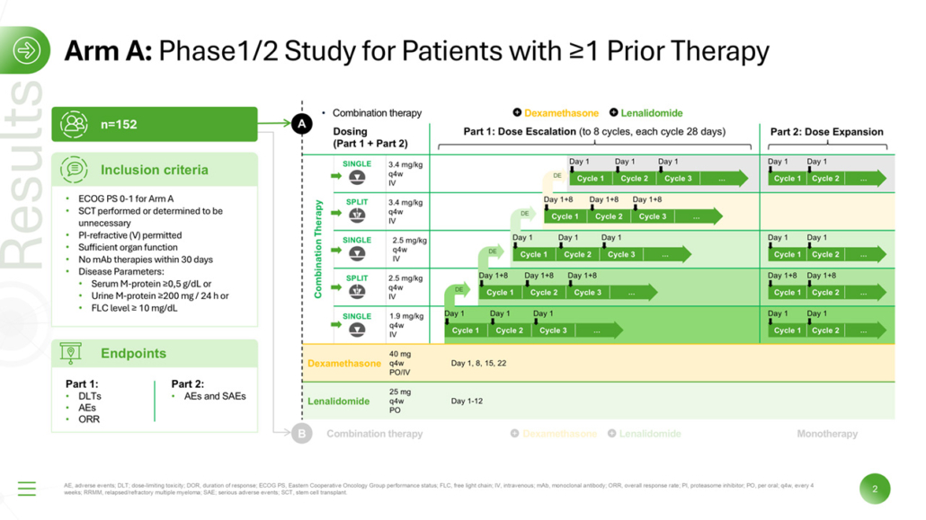


When presenting study data, it can be easy to breeze through the design and methods and then focus more intently on results, but this can make it difficult for the audience to grasp the meaning of those results. For example, if the study design involved a crossover or patients moving from a placebo-controlled trial into a long-term open label study, this may be critical for understanding how different participants responded to a treatment. A visual representation of the study design with the relevant aspects highlighted and the rest faded out can help the audience keep track of where specific results are coming from.
Build up challenging data step by step
Every slide and every visual in a presentation should be a stepping stone for your audience. Make sure those stepping stones are close enough together, so your audience doesn’t need to take big leaps to follow you. This may seem obvious, but some presenters have a tendency to speed up and skip over the next logical step when they anticipate the audience will be confused by a certain topic, graphic, or dataset. It’s true that prolonged, in depth discussions of statistical methods can risk getting lost in the weeds, especially when the presenter or the audience does not feel comfortable with these topics. That is why it is all the more important to be prepared with visuals that help you and the audience approach such topics step by step.
For example, do you need to present a PK plot with a logarithmic y axis, but you’re worried your audience either won’t understand or won’t trust it? You can show the same data plotted against a linear y axis first. Then demonstrate how certain questions can’t be answered when the data is shown this way, like how the point where two PK curves intersect is not visible on a linear scale. This makes the justification of using a logarithmic scale clear.
Use a more robust visual approach that can show multiple datasets at the same time
Sometimes two axes just are not enough. Multidimensional data calls for a visual approach that stays clear and accurate while finding creative ways to represent different facets of the results.
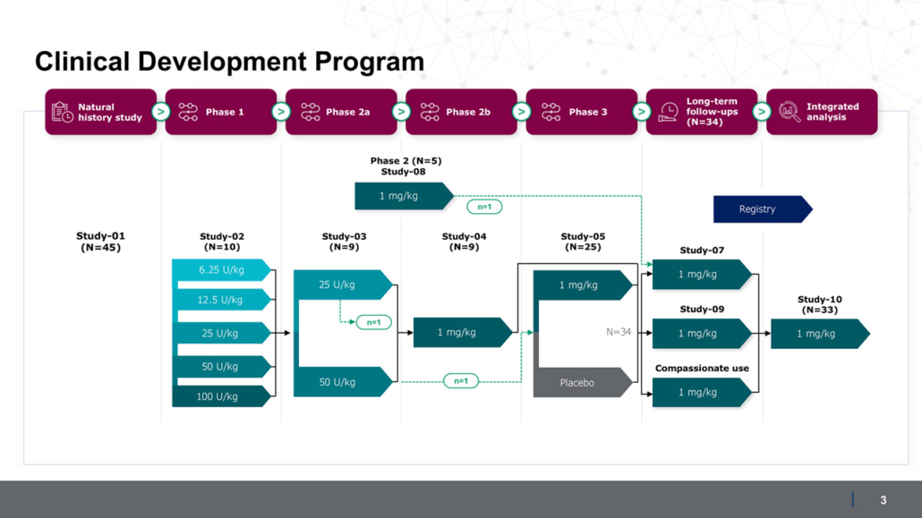
Let’s say the design of the entire clinical development program needs to be shown to give context to a smaller study, which includes participants from phase 2 and 3 clinical trials as well as a long-term extension study. As planned in the protocol, patients exit the study when they experience an event, meaning that the sample size decreases throughout the duration of the study. To communicate results from this study, powerful visuals are needed that could capture multiple facets and nuances of each participant’s journey.
When working with this number of different factors, it may be useful to use a script to generate a spreadsheet from the data listings for each participant in the study.
The spreadsheet can then be combined with HTML, Python or JavaScript for more dynamic and more powerful visualizations such as:
These are just a few examples of engaging ways to present challenging data. The best approach will be the one that presents your data with the most clarity, accuracy, and transparency. After all, you want your data to show that you are a reliable partner for medical information.