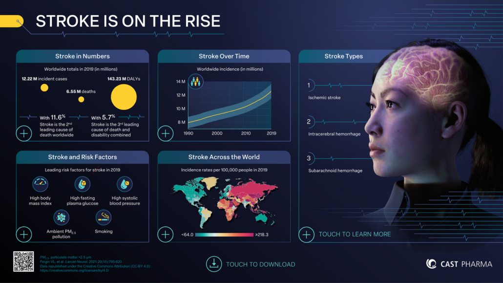
Interactive infographics in scientific communication: transforming complex data into engaging visual narratives
Interactive infographics address these needs by allowing users to explore scientific data according to their interests. In MSL-HCP conversations, they enable quick navigation of relevant efficacy or safety data. At conference booths, they transform static posters into engaging scientific discussions. For medical training, they allow teams to learn complex mechanisms of action or clinical data at their own pace.
This article will examine how to build and implement interactive infographics, focusing on what makes them effective tools for pharmaceutical teams.
Flipping the pyramid: applying the pyramid principle to scientific storytelling
In traditional peer-reviewed publications, readers often encounter supporting data before reaching the main conclusions. The results precede the discussion and conclusion. While this structure serves well in academic publishing, it may not be the most effective approach for engaging busy HCPs or diverse scientific audiences.
The pyramid principle advocates for a different approach: share your most important information first. By presenting the key message upfront, followed by contextual details and supporting information, you help the audience understand the data more easily. They also can organize the information more effectively. And then they can engage more closely with the details as they navigate through the content.
The anatomy of interactive infographics
At the heart of every successful interactive infographic lies a powerful combination of visual storytelling and active audience engagement. While static infographics can effectively present information, interactive elements transform passive content consumption into dynamic, memorable experiences. To understand what makes interactive infographics effective, it is important to examine their core components:
1. Visualizing data
Interactive infographics excel at transforming complex clinical data into clear visual narratives. Rather than presenting static tables or graphs, they create dynamic visualizations that invite exploration. For example, when presenting clinical evidence, users can examine efficacy data through responsive charts, compare different patient populations, or investigate safety profiles—all guided by their specific interests. This approach transforms data review from a linear process into an engaging journey of scientific discovery.
2. Navigating through user-driven interfaces
Navigation in interactive infographics mirrors how medical experts and HCPs naturally think about and discuss medical concepts. Through thoughtfully designed menus and visual cues, users can follow their professional intuition–moving seamlessly from mechanism of action to clinical outcomes, or from safety data to practical applications. This intuitive navigation keeps users engaged and promotes comprehensive understanding.
3. Integrating multimedia
Modern scientific communication demands more than static images. Animated videos illustrate complex mechanisms of action; interactive data displays enable detailed exploration of trial results; audio explanations supplement visual information. This multisensory approach does not just present information; it creates an immersive learning experience that enhances understanding and retention.
4. Enhancing knowledge retention
Consider an MSL presenting a new monoclonal antibody’s mechanism of action. Instead of showing static pathway slides, they use an interactive visualization. The HCP can step through the binding process, examine target interactions, and explore downstream effects—all based on their specific interests.
Similarly, when presenting clinical trial data, the interaction becomes personal. An oncologist reviewing a new treatment can begin with overall survival data and then examine response rates for specific patient groups, such as age or genetic markers. When questions arise about safety, they can immediately investigate the relevant adverse event profiles.
The power lies in immediate feedback and personalized exploration. Users can revisit complex concepts, focus on areas of particular interest, and develop understanding at their own pace. Whether it’s a seasoned specialist quickly reviewing new data or a resident building foundational knowledge, the interactive format ensures that information isn’t just presented, but truly understood and retained.
Interactive infographics in practice
Having explored the foundational elements of interactive infographics, it is valuable to see how these components come together in real-world applications. Interactive infographics serve three key areas of scientific communication in pharmaceuticals: MSL-HCP interactions, conference engagement, and medical education.
During HCP interactions, MSLs must balance comprehensive scientific information with limited time. An MSL discussing a new therapeutic approach can instantly respond to a physician’s interests. If safety data is crucial to the discussion, they access it immediately. If the mechanism of action becomes the focus, that pathway is just as accessible. This flexibility makes conversations both efficient and meaningful.
At scientific conferences, interactive displays help booths stand out while maintaining scientific credibility. Visitors examine phase III results using interactive touchscreens, focus on specific endpoints, and comparing subgroup analyses. This self-guided exploration facilitates deeper scientific discussions.
 For medical learning and training, interactive infographics create layered learning experiences. When training teams on a new biological therapy, the base layer covers fundamental mechanisms, while deeper layers explore clinical trial data and real-world evidence. Built-in assessments provide immediate feedback, and teams learn at their own pace, focusing on areas most relevant to their roles.
Exploring the different formats of interactive infographics
Understanding the practical applications of interactive infographics highlights the importance of selecting the appropriate format to meet specific needs. To look at the different formats in detail and try them out yourself, you can download our interactive infographics brochure containing all links to the different examples.
Interactive PDF
Ideal for situations requiring broad accessibility and easy distribution, interactive PDFs combine basic interactivity with universal compatibility. They excel in scenarios where simple, clear navigation through complex data is the priority. Quick to create and with a small file size, it’s ideal for emailing or downloading, making it particularly effective for sharing scientific information.
Interactive PowerPoint
PowerPoint-based interactive infographics combine familiar functionality with multimedia capabilities. During symposia or advisory boards, presenters can switch between guided presentation and interactive exploration of clinical data. The same material serves for self-study, with integrated video demonstrations of molecular pathways or audio explanations of complex trial designs.
Interactive HTML
This format provides maximum interactivity and can be uploaded to websites or learning management systems as SCORM modules. At conference booths, it enables exploration of phase III data through touchscreens, with embedded animations showing drug mechanisms. For internal training, it offers interactive assessments, games, and comprehensive scientific knowledge checks. Content updates can be made on the server while maintaining the same access link, ensuring users always see the latest version.
Interactive Booklet
Unlike most other formats, the interactive booklet framework allows for significant interactivity with a built-in responsive design. It adapts automatically to different screen sizes on smartphones, tablets, and laptops. Since updates can be made centrally while keeping the same access link, teams always work with the latest content. This makes it particularly effective for materials that need to be accessed on mobile devices like on-the-go reference and microlearning applications.
The choice of format primarily depends on the technical environment of you or your audience and how the content will be accessed. Consider whether they will use large screens or mobile devices, and how often the content needs updating.
Making the right choice
Selecting the appropriate format for an interactive infographic depends on several factors, including audience needs and technical constraints:
Who is your audience and what are their constraints? MSLs typically bring tablets to HCP discussions, while medical training often happens through eLearning platforms. Conference attendees can fully engage with touchscreen displays in booths.
How will you share the content? If you’re sending post-read materials to HCPs via email, Interactive PDF is often the best choice. For symposia presentations, Interactive PowerPoint offers the flexibility needed. eLearning platforms work best with Interactive HTML, while Interactive Booklet is perfect for quick microlearning modules.
How complex is your content? Simple trial data presentations work well in Interactive PDF format. When explaining complex mechanisms of action with animations, Interactive PowerPoint or HTML might be the better choice. For bite-sized training content, Interactive Booklet’s mobile-optimized approach makes learning accessible anywhere.
What level of interaction do you need? Sometimes simple navigation through trial data is enough. Other times, you might need more engaging features like step-by-step molecular pathway explorations or interactive assessments for eLearning.
Conclusion
Interactive infographics are transforming scientific communication in pharmaceuticals and biotechnology. By combining visual storytelling with user-driven exploration, they provide a powerful way to convey complex data. Teams can choose from various formats—from interactive PDFs to comprehensive HTML applications—based on their technical needs, and communication goals. These tools excel in key business scenarios: they enable effective MSL-HCP discussions, create engaging conference booth experiences, and deliver impactful medical training. By respecting the audience’s time and preferences while maintaining scientific rigor and accuracy, they make complex scientific information more accessible, engaging, and—most importantly—understood.


